 |  |  |  |
|---|---|---|---|
 |
CNBC Tv-18
Roles: Project Head, Design Manager, Content Strategist, Information Architecture Design,
User Experience Design
Task:
To design and create an interactive sales presentation that is unique and represents the juggernaut
called 'The CNBC Network.'
Inspiration:
The legacy, heritage & business verticals of the brand.
Workflow:

1. Briefing
2. Ideation
3. Concept Creation
4. Information-
Architecture Design
5. Content Planning
6. Copywriting
1. Concept Presentation
2. Concept Selection
3. Client Approval
1. Prototype Creation
2. Usability Testing
3. Sound Design
4. Design Revisions
5. Client Approvals
1. Execution
2. Artworks
Solution:
The brief was to design an interactive sales presentation in powerpoint format. This presentation would be used by the CNBC Tv-18 sales representatives as a marketing & sales tool to promote their brand and
persuade media planners to purchase advertising space on their channel.
The CNBC network comprises of multiple channels, business verticals, mediums, and brand properties.
The network is renowned as an experienced leader, facilitator, and a credible market influencer. To visually represent this herculean network as an intricate 'turnkey system' made up of multiple components,
a 'cog' theme was ideated.
Distinct layouts and animated cogs inscribed with unique graphics represented and outlined the various sections of the presentation. The flow of the content was designed to start with a broad overview of the network, leading through up to the most minute sales details. The presentation was divided into various sections which were based on a range of topics that included : The CNBC Legacy, Key Differentiators,
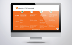
Brand Positioning, Access Points, Viewer's Profile, Viewership ratings and Testimonials from the leaders
of the nation.
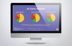
To increase the 'perceptual fluency' and maintain a corporate look & feel, a color palette was derived from the existing brand colors to tie up the overall presentation. For the data sections, a specially designed layout with intelligible charts and infographics visually represented the numbers to reduce the 'cognitive workload'. This engaged the audience while efficaciously communicating the channel ranking, program ratings, viewership data and the sales intent in a simplistic manner.
To heighten the overall sensory impact, an audio theme was specially created with the help of a sound designer. The theme was an extension of the brand's existing sound bite. This provided the presentation with a touch of familiarity and was utilized as an occasion for audio branding at the same time. Depending on the content of the section; the tone, mood, and pace of the music would change to compliment the content and offer a positive reinforcement.
In order to accomplish maximum flexibility and ease of use, the entire presentation was meticulously structured to be modular. Thus, even if a complete section or few slides were to be removed or shuffled,
it would not disrupt the flow or dampen the visual impact of the overall presentation.